Contrast
Design Principles
Emphasizes differences between elements (e.g., color, size, type) to create visual interest and highlight important information.
In practice
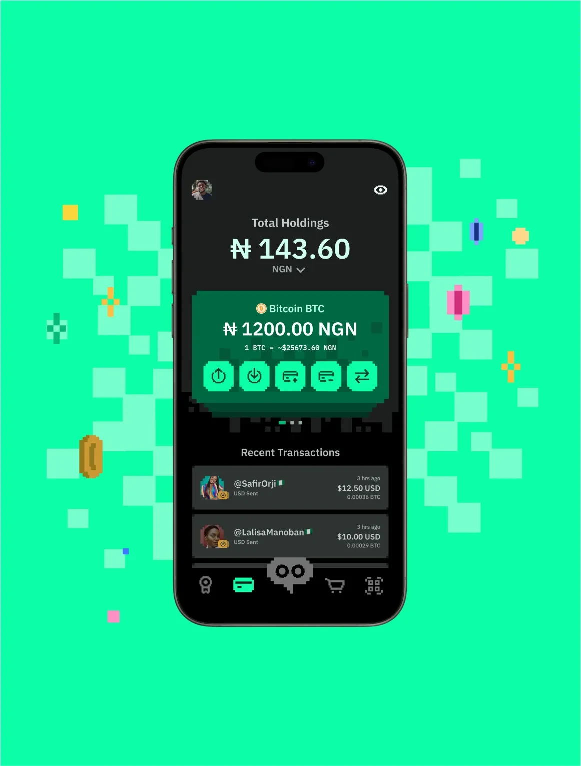
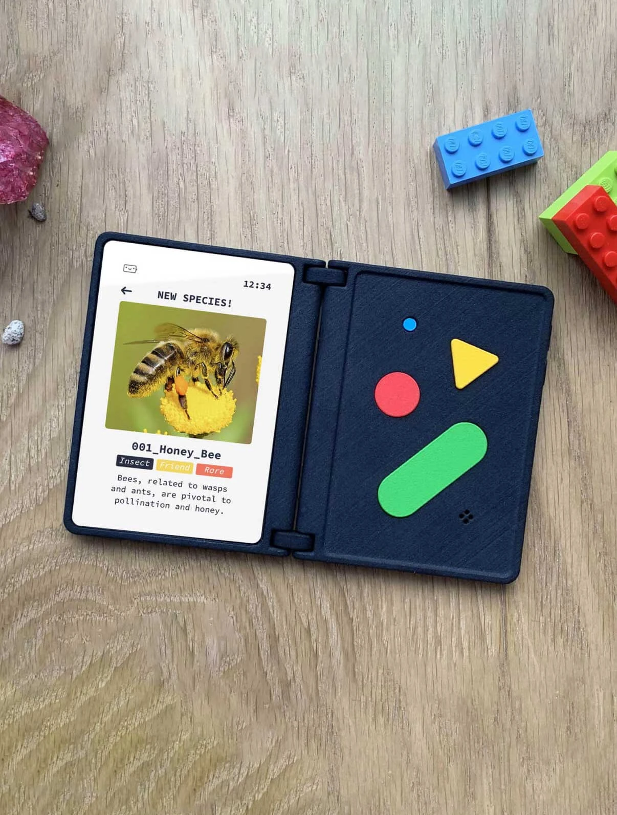
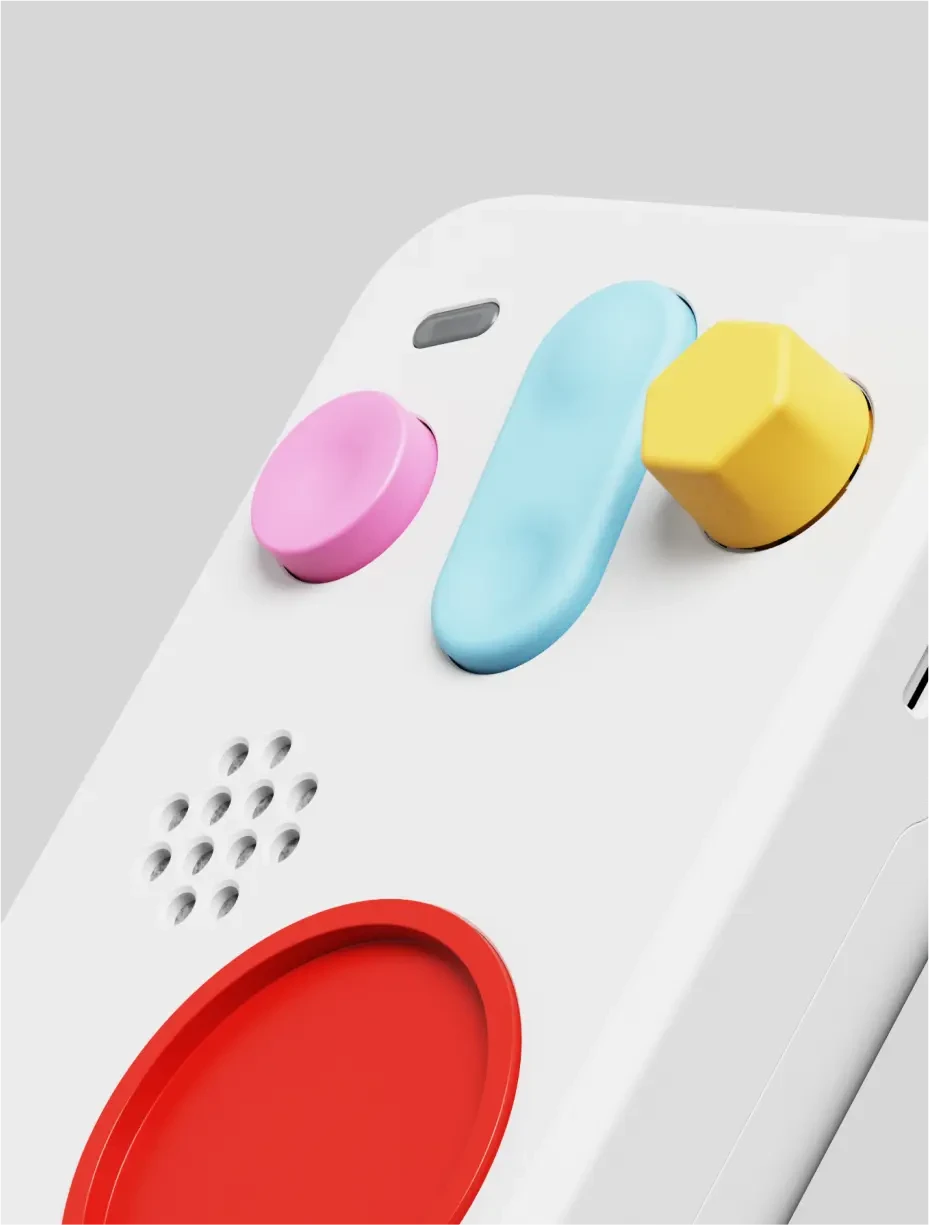
Throughout design, contrast involves the juxtaposition of different visual elements to create emphasis, highlight distinctions, and add visual interest. Designers use contrast in color, size, shape, and other elements to make certain elements stand out, enhancing clarity, and creating dynamic and engaging visual compositions.
Questions
What is Contrast?
Contrast is the difference between elements — in size, weight, colour, or space — that makes one read as distinct from another.
Why do you use Contrast?
Without contrast everything has equal weight, so nothing is findable. It is the main tool for directing attention.
How do you use/apply Contrast?
Make differences deliberate and large enough to read as intentional. A near-miss looks like a mistake; a clear difference looks like a decision.
When do you use Contrast?
In every composition, and critically in anything that must be legible at speed or at distance.
Who uses Contrast?
Graphic and product designers; also an accessibility requirement with measurable minimum ratios.