Mobile-First
Design Principles
Design the small screen first, then expand — because constraint clarifies.
In practice
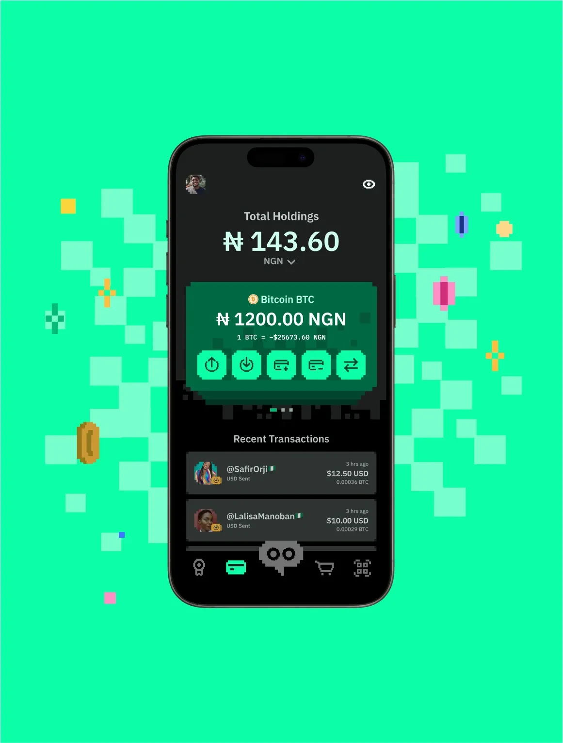
Mobile-first, coined by Luke Wroblewski, is the discipline of starting design and code at the smallest viewport, where space forces you to decide what truly matters, then progressively adding for larger screens. It produces leaner, more focused products and lighter code, and it reflects the reality that for most of the world the phone is the primary or only screen.
Questions
What is Mobile-First?
Mobile-first is a design and development approach that begins with the mobile experience and scales up, using its constraints to prioritise content and function.
Why do you use Mobile-First?
Designing big and squeezing down loses things arbitrarily. Designing small and growing keeps what earned its place.
How do you use/apply Mobile-First?
Lay out and build for the smallest target first, decide hierarchy under real constraint, then add layout, features and density as the viewport allows.
When do you use Mobile-First?
For essentially every web product, and for any product whose users are mostly on phones.
Who uses Mobile-First?
Product, UX and front-end designers and developers.