Dark Mode
Design Processes
A version of the interface with light text on dark surfaces, usually following the system setting.
In practice
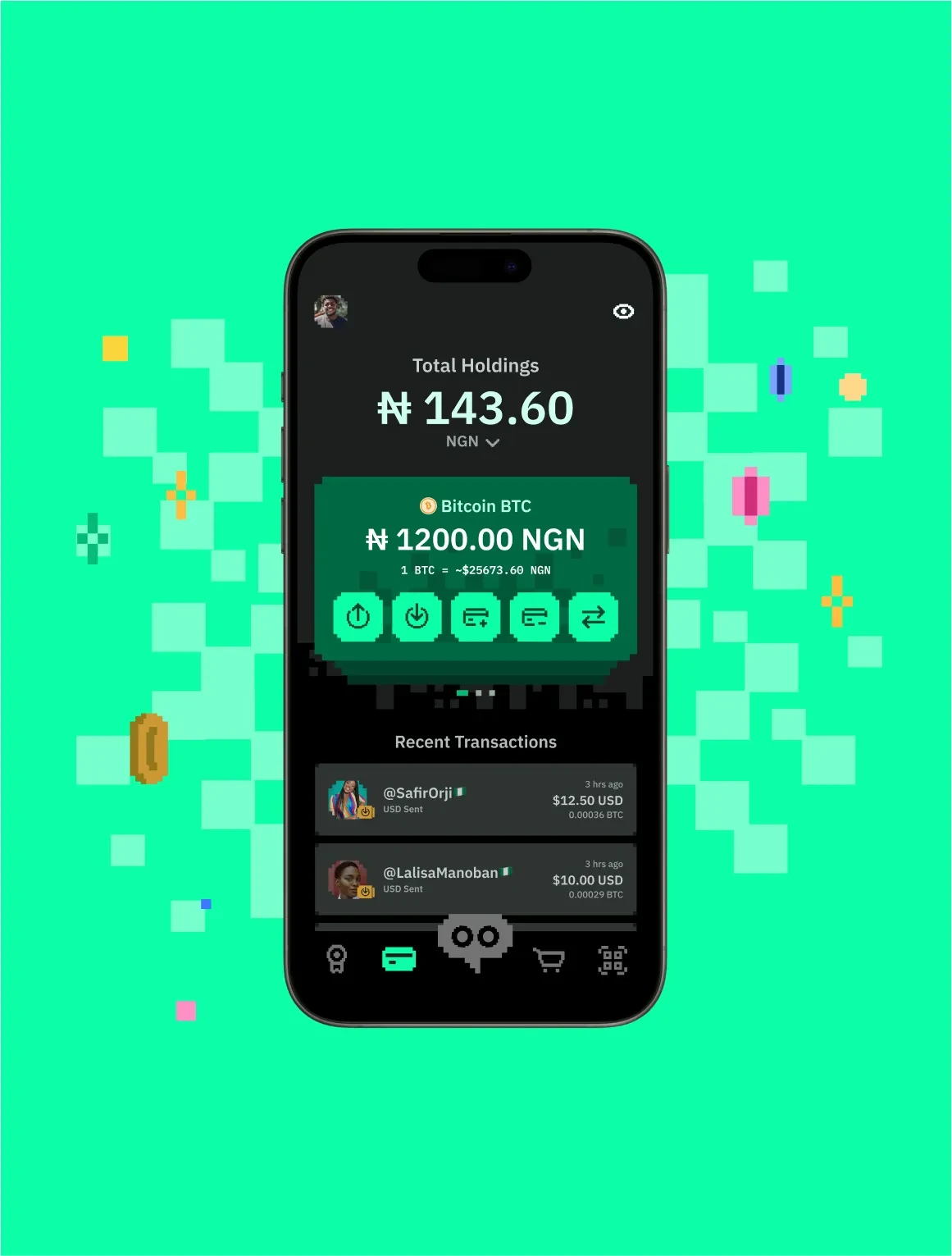
Dark mode is a full alternate colour scheme, not an inverted one: surfaces become dark, text becomes light, and every colour — accents, borders, states, imagery treatment — has to be re-chosen so contrast, hierarchy and brand still hold. Done well it follows the user's system preference automatically and can be overridden; done badly it is a grey wash where nothing reads.
Questions
What is Dark Mode?
Dark mode is a deliberately designed dark colour theme for an interface, typically applied according to the user's operating-system preference.
Why do you use Dark Mode?
People expect it, it suits low-light use, it can save power on OLED screens — and a product that ignores the system setting feels unfinished.
How do you use/apply Dark Mode?
Define colours as tokens with light and dark values, design both themes side by side, check contrast in each, and let the system preference choose with a manual override.
When do you use Dark Mode?
From the start of a product's colour system. Retrofitting it is far more work than designing for it.
Who uses Dark Mode?
Product and brand designers, and the developers wiring up theme tokens.