Responsive Design
Design Processes
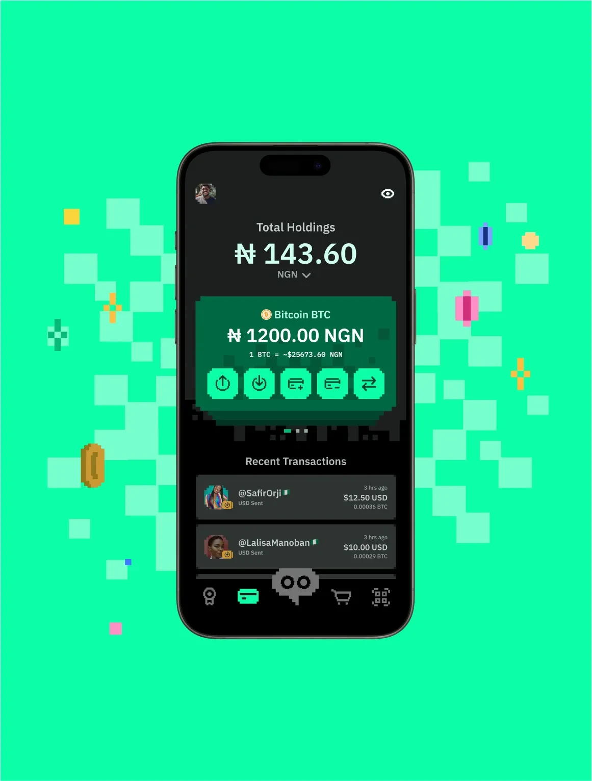
Designing digital interfaces that seamlessly adapt to various screen sizes and devices, providing a consistent user experience. Responsive design uses flexible layouts, images, and media queries to ensure optimal display on desktops, tablets, and mobile devices, enhancing accessibility and usability.
In practice
Refers to designs that adapt and respond to different screen sizes and devices. Responsive design is essential in contemporary web design to ensure optimal user experiences across a range of devices. Its importance lies in providing a seamless and user-friendly interaction regardless of the device being used. By embracing responsive design principles, designers enhance accessibility and usability, meeting the diverse needs of users and improving overall satisfaction with the digital experience.
Questions
What is Responsive Design?
Responsive design builds one interface that adapts its layout to the size and capability of whatever screen it is shown on.
Why do you use Responsive Design?
People arrive on every size of device. Maintaining separate designs for each is expensive and they always drift apart.
How do you use/apply Responsive Design?
Design from the smallest viewport up, use fluid units and breakpoints tied to the content rather than to device names, and test on real hardware.
When do you use Responsive Design?
On anything delivered through a browser, which is nearly everything.
Who uses Responsive Design?
Product designers and front-end engineers.