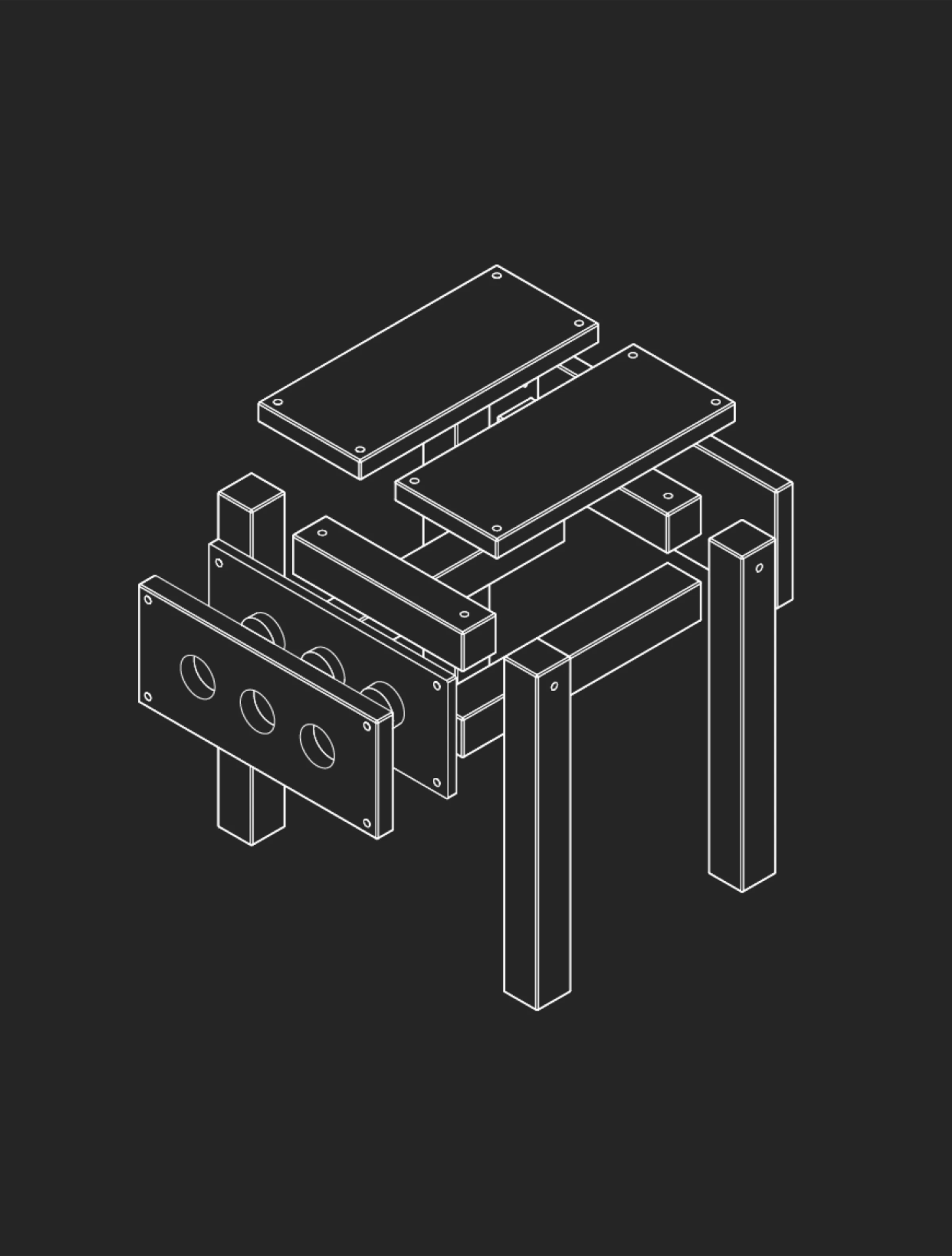
White Space/Negative Space
Design Principles
Allows for empty or negative spaces around and between elements to enhance readability and focus.
In practice
In design, white space or negative space refers to the unoccupied areas around and between visual elements in a composition. Designers intentionally incorporate white space to provide visual breathing room, enhance readability, and create a sense of balance. White space plays a crucial role in preventing visual clutter, allowing elements to stand out, and contributing to an overall aesthetic that prioritizes clarity and simplicity in design.
Questions
What is White Space/Negative Space?
White space is the empty area around and between elements. It is not leftover, it is a material.
Why do you use White Space/Negative Space?
It creates grouping, hierarchy and calm. Crowded layouts fail not because the elements are wrong but because there is nothing between them.
How do you use/apply White Space/Negative Space?
Treat space as deliberate: use a consistent scale, give important elements more room, and resist the pressure to fill everything.
When do you use White Space/Negative Space?
In every composition. It is usually the first thing sacrificed and the first thing to restore.
Who uses White Space/Negative Space?
Graphic, product and editorial designers.